
How to Choose Silk Scarf Colors for Brand Collections: Style, Season, and Production Guide
Choosing scarf colors is not only a styling decision. For brand buyers, color affects collection mood, target customer, seasonal merchandising, Pantone approval, silk fabric selection, print testing, edge finish, label placement, packaging, and repeat-order consistency.
Build a Scarf Color Brief Before Artwork Starts
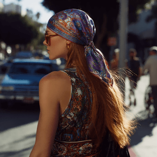
A brand color brief should be more specific than "make it pink" or "use autumn tones." Before designing a custom silk scarf, buyers should define the target customer, product price level, collection mood, key outfits, sales season, gift or retail purpose, and the number of colorways needed.
For example, a museum merchandise scarf may need colors that match artwork licensing and exhibit identity. A boutique fashion scarf may need wearable neutrals plus one accent color. A corporate gift scarf may need brand colors to remain recognizable without making the scarf look like a uniform item.
Plan Seasonal Palettes Without Chasing Every Trend
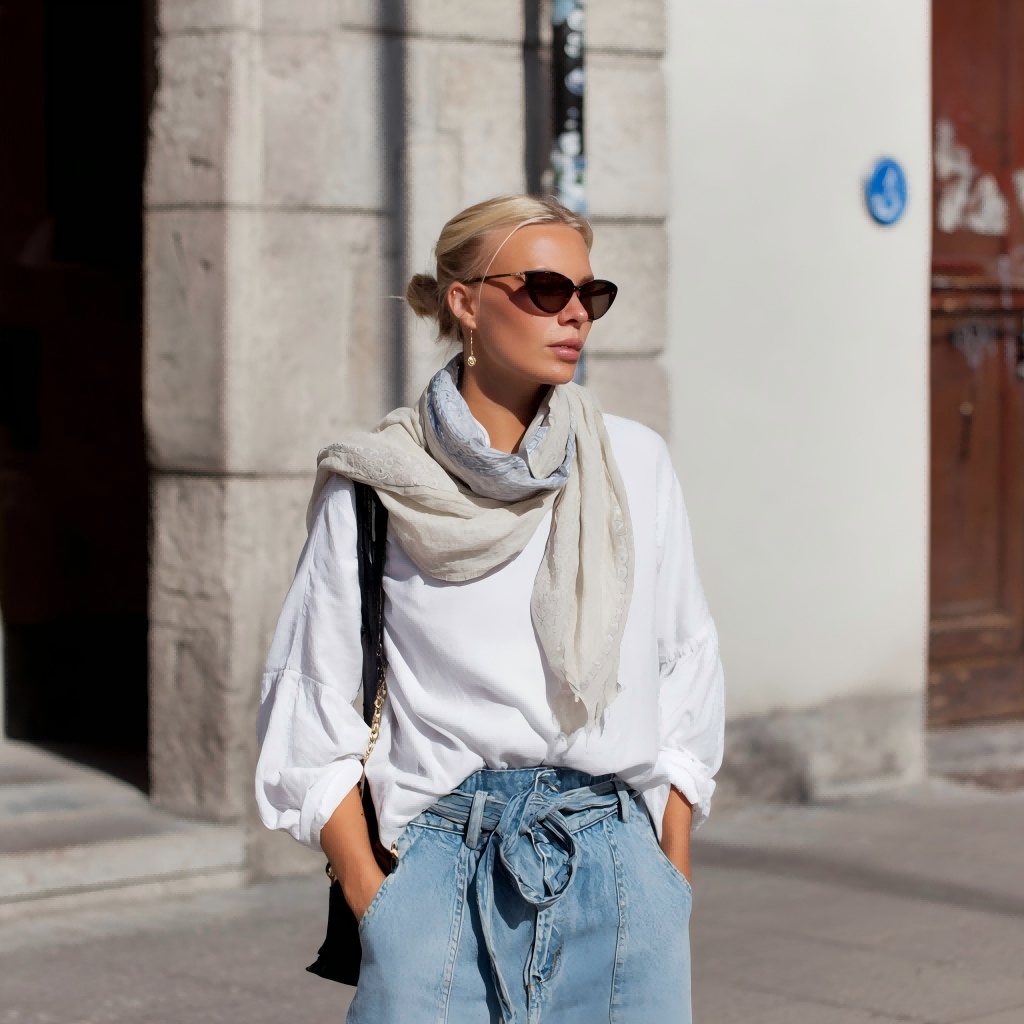
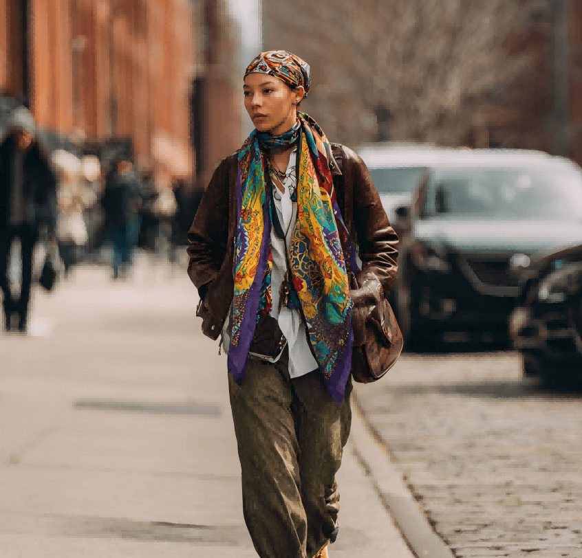
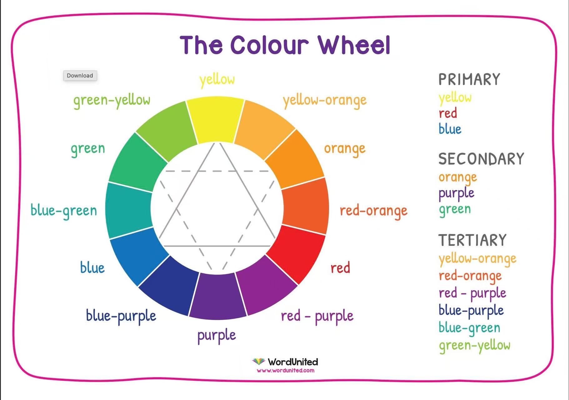
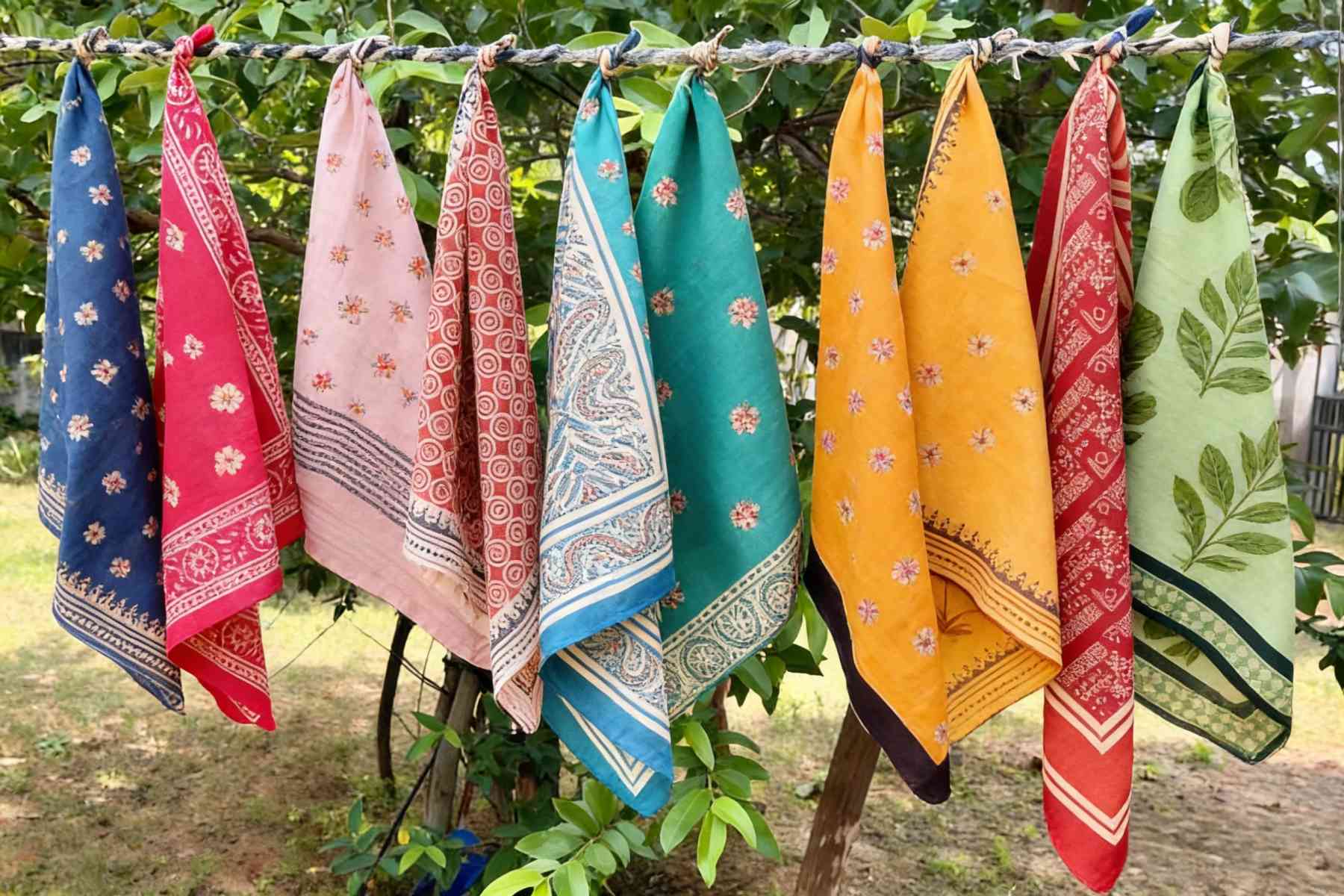
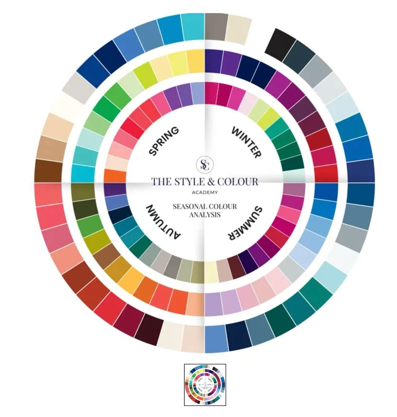
Seasonal color planning works best when it supports a clear product story. Spring palettes may use lilac, peach, mint, or soft pink. Summer scarves can carry brighter greens, watermelon tones, clear blues, or energetic prints. Autumn often supports rust, wine, camel, olive, and warm brown. Winter can lean into burgundy, charcoal, navy, black, ivory, metallic accents, and deep jewel tones.
The stronger strategy is to create a small color system: one base color, one supporting neutral, one accent color, and one optional dark tone for borders or logo placement. This gives the designer room to build artwork while keeping the collection easy to merchandise.
| Color direction | Best use | Buyer note |
|---|---|---|
| Neutral and soft tones | Core retail styles, corporate gifts, quiet luxury, everyday wear | Check contrast so logos, borders, and labels remain visible. |
| Bright seasonal colors | Window display, resort, summer, limited drops, youth-focused collections | Approve a physical color proof because bright colors shift across fabrics. |
| Jewel tones | Premium gifts, evening styling, museum stores, holiday assortments | Use border spacing and color balance to keep the design elegant. |
| Brand colors | Corporate scarves, uniform accents, loyalty gifts, private label products | Provide Pantone codes or approved physical swatches before sampling. |
Use Skin Tone Guidance as Retail Support, Not the Whole Strategy
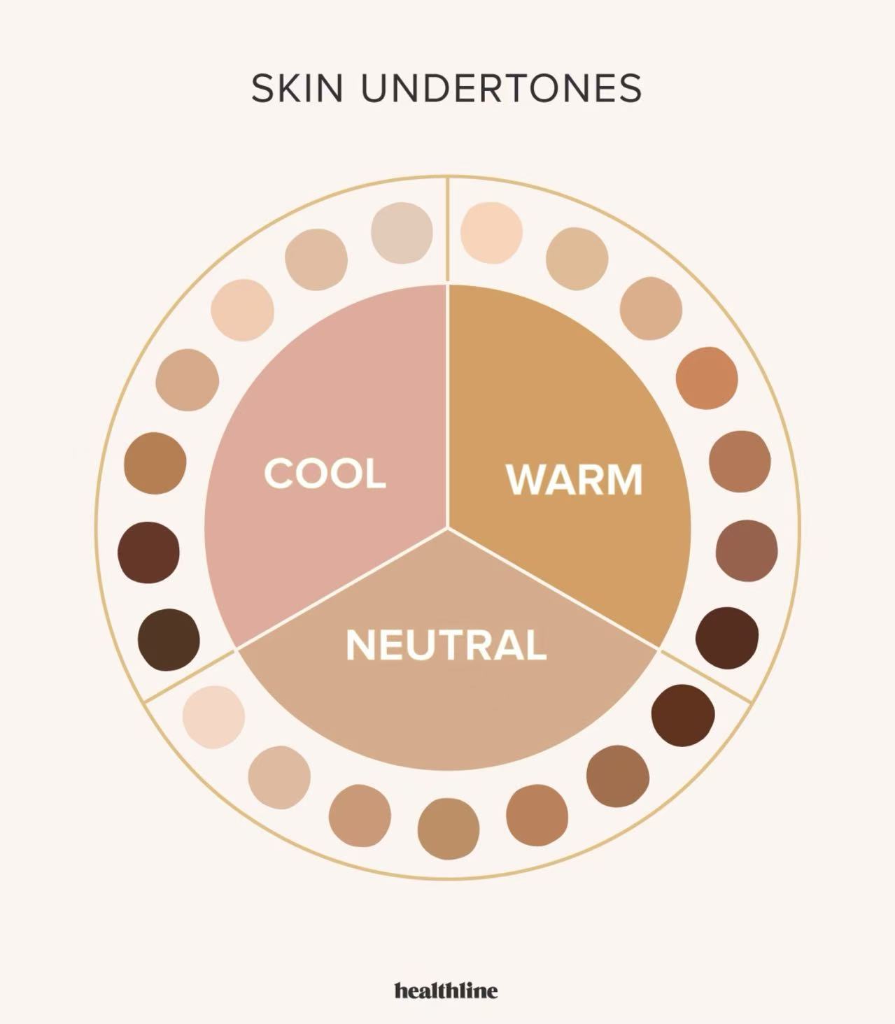
The original consumer-style advice about warm, cool, and neutral skin tones can still be useful for retail copy. Warm undertones often pair well with terracotta, mustard, camel, olive, and scarlet. Cool undertones often suit cobalt, lavender, blue-red, emerald, and charcoal. Neutral undertones can wear many palettes.
For brand development, however, the more important question is who will buy and wear the scarf. A luxury gift customer, a resort traveler, a museum visitor, a boutique fashion buyer, and a corporate recipient may all need different color logic. This is where custom scarves should be planned by scenario rather than by personal styling rules alone.
Match Color Direction With Silk Fabric and Printing
The same color will not look identical on every silk base. Silk twill gives color a more structured premium surface and works well for square scarves with borders. Silk satin and crepe satin can make colors look smoother and more luminous. Silk chiffon is lighter and more translucent, so colors may feel softer. Silk wool blends can reduce sharp shine and create a warmer seasonal effect.
For accurate production, connect the palette with fabric, colors, and craftsmanship choices before proofing. Detailed artwork, gradients, and multi-color illustrations often work well with digital printing. Brand colors, fewer-color artwork, and stronger solid areas may need extra discussion through custom printing review.
Connect Color Choices With Size and Wearing Use
Scarf size affects how much color a customer sees when the item is worn. A twilly or narrow ribbon scarf may need stronger contrast because only a small part of the artwork is visible. A 53cm or 70cm square scarf can carry a more compact border and central motif. A 90cm square scarf gives more room for storytelling, color blocks, and corner details. Long scarves and large squares may need repeated color rhythm so the design still works when folded.
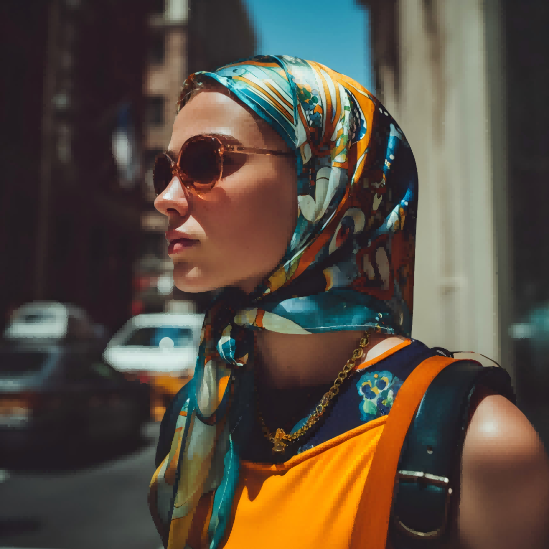
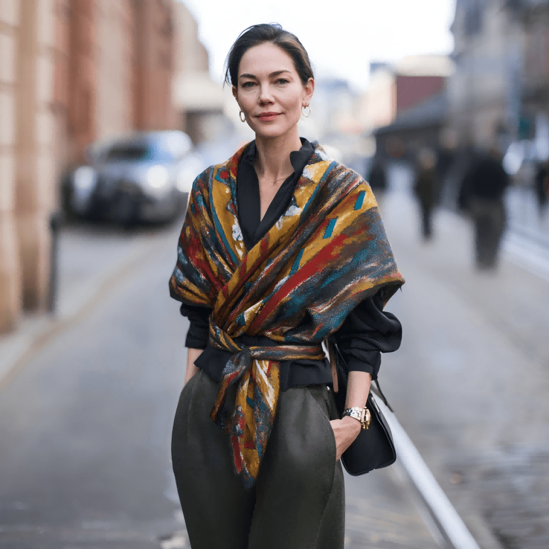
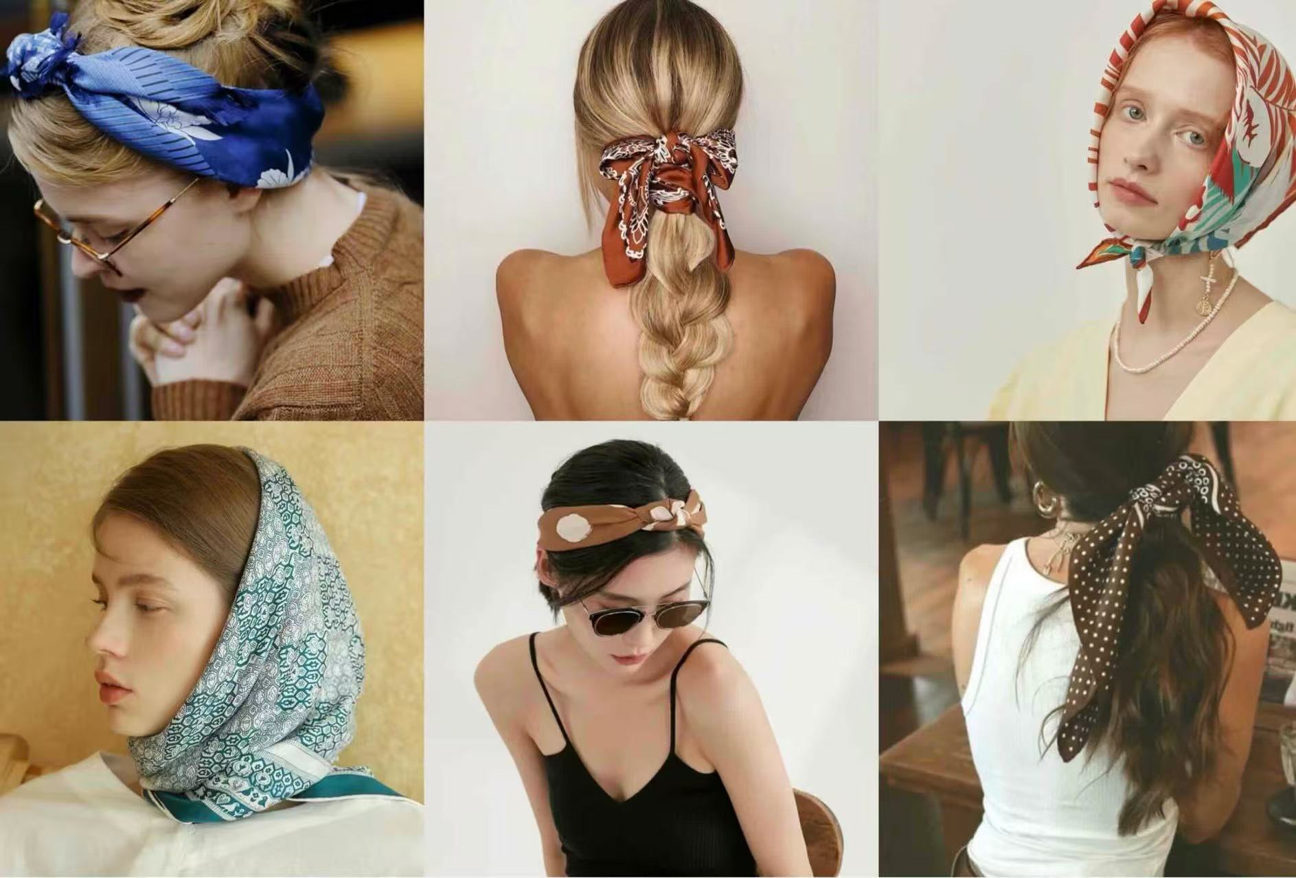
If the scarf will be worn as a neck scarf, hair scarf, headscarf, bag accessory, belt, top, or resort styling piece, the color plan should be tested in folded views. What looks balanced flat may show only one color when tied.
Control Color Risk in Sampling and Bulk Production
Color risk usually appears in four places: the artwork file, the screen view, the fabric surface, and the bulk production batch. A buyer should provide Pantone codes, approved physical swatches, or previous product samples when exact color matching matters. DOCSUN can help translate those references into a sample-ready color plan, but the physical sample is still the key approval step.
Edge finish also affects color layout. Hand rolled hems, machine hems, and overlock finishes all need margin planning so borders, logos, and pattern lines are not cut or distorted. If labels, care labels, hangtags, gift boxes, drawer boxes, or polybags are part of the project, the packaging palette should be approved alongside the scarf, not after the fabric is already printed.
For many custom silk scarf projects, MOQ can start from about 30 to 50 pieces depending on fabric, size, print method, edge finish, label, and packaging. Sampling usually takes about 5 to 7 working days after artwork, color references, size, edge, label, packaging, and quantity details are confirmed.

Make Packaging Part of the Color Story
A scarf color story does not end with the silk. Brand labels, woven labels, printed care labels, hangtags, belly bands, tissue paper, gift boxes, drawer boxes, and mailer packaging all affect the first impression. For a premium scarf collection, packaging should support the scarf palette without competing with it.
Buyers can prepare a simple packaging brief through custom packaging: box style, logo color, insert card, care message, barcode need, retail display method, and shipping protection. This helps the scarf arrive as a finished product, not only as printed fabric.
FAQ
How should a brand choose colors for a custom silk scarf collection?
Start with the customer profile, season, sales channel, brand palette, artwork mood, and use case. Then confirm fabric, print method, Pantone or physical color references, edge finish, label plan, packaging, quantity, and sample approval before bulk production.
Should silk scarf colors follow skin tone rules?
Skin tone guidance can help retail styling, but brand buyers should not build the whole collection around it. It is better to define the target customer, wardrobe context, seasonal mood, price level, and how the scarf will be worn or gifted.
Why can the same color look different on silk twill, satin, chiffon, and silk wool blends?
Different silk fabrics reflect light differently. Satin and crepe satin can look brighter and smoother, twill can look more structured, chiffon is lighter and more translucent, and silk wool blends can soften color for warmer seasonal scarves.
What should buyers approve before bulk production?
Buyers should approve a physical sample showing fabric, artwork scale, color result, print method, edge finish, label position, packaging, size, care details, and any color tolerance notes for repeat orders.
Develop a Custom Silk Scarf Color Plan With DOCSUN
Send your artwork idea, target season, preferred colors, Pantone references, scarf size, silk fabric, edge finish, label plan, packaging needs, quantity, and launch schedule. DOCSUN can help turn the color direction into a sample-ready custom scarf project.
Start a Custom Scarf Color ProjectFor product options, start with the custom silk scarf service page.